VOLT Cycles
Goal: turn browsers into test rides
A product page for an e-bike you can’t test-ride. So the page has to do the test ride’s job.
- Brief
- Self-initiated concept
- Sector
- Electric bicycles, direct-to-consumer
- Scope
- Homepage, product page, 3-step order
- Role
- Design and build, solo
- Year
- 2026
Photography
Product shots
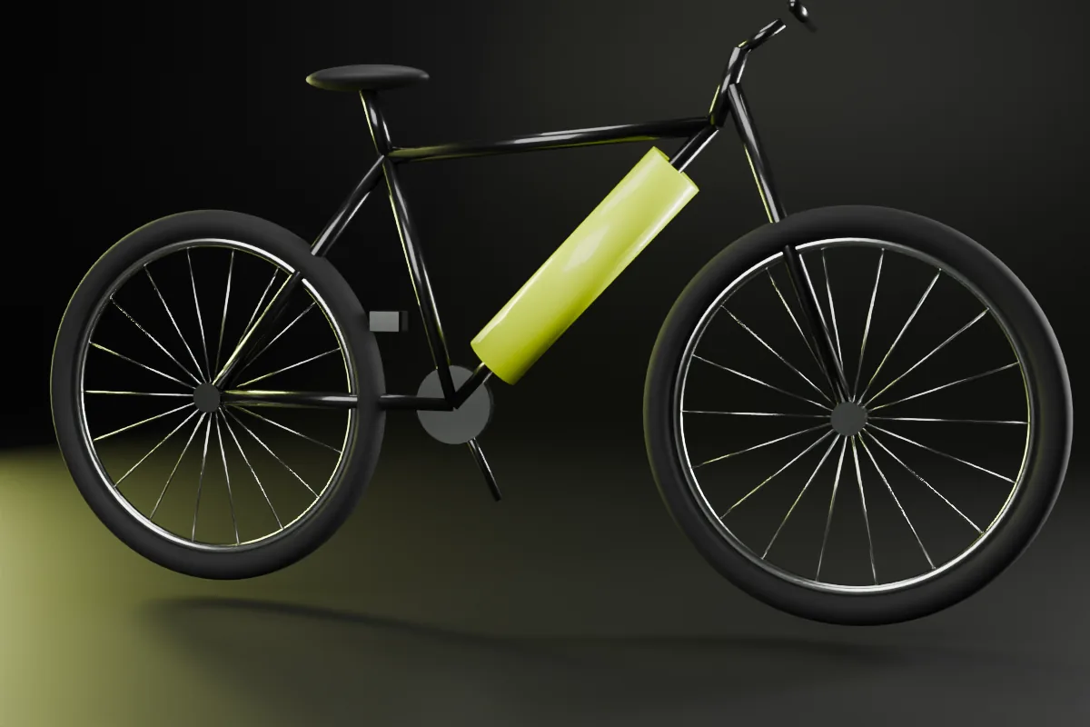
Black studio, hard rim light, one yellow accent. The bike is always shown whole and side-on first — the angle people compare bikes from.
The brief
The brief
VOLT is a made-up direct-to-consumer e-bike brand. One model, the VOLT/ONE, sold online only. I wrote the brief myself: design a product page that can sell a bike costing as much as a second-hand scooter to someone who can’t ride it first.
The problem
The problem
E-bike sites sell a lifestyle and hide the spec sheet. People spending this much want the spec sheet.
The usual pattern: a bike on white, a video of someone laughing on a mountain, and the numbers buried in a PDF. Buyers who spend this much compare everything. If the page won’t answer them, they open a new tab and find a page that will.
My approach
Three moves
Lead with the bike, not a lifestyle.
No sunset video, no model laughing at a lake. One bike, big, turning slowly, and you can drag it round. The thing you’re buying is the hero.
Put the spec sheet on the page.
Range, weight, charging, licence — in a table, next to a typical city e-bike and a typical scooter. No rival brands. Just the options a buyer is actually weighing.
Three steps to order.
Colour. Size, picked from your height. Pay. Accessories and insurance wait until the bike is reserved, not before.
Design decisions
Style tile
Black and one electric yellow. Yellow is only ever used for two things: numbers and the button that takes your money. If it’s yellow, it matters.
Type2 families
Anton is loud and narrow, so big numbers fit in small spaces. Archivo is plain enough to stay out of its way.
Colour4 tokens
Layout12 col · product page
Components3 of 14
Reserve yours →Desktop + mobile
The product page
On desktop the order panel sits beside the bike. On a phone it becomes one bar pinned to the bottom of the screen, so “Reserve” is always one thumb away.
What it’s meant to do
The goals
- Answer the five questions people ask before buying — range, weight, charging, servicing, returns — without leaving the page.
- Turn sizing into one question: how tall are you?
- Make the 14-day return impossible to miss. It’s the test ride, just delayed.
- Load the hero fast on a mid-range phone. A target, not a measurement.
No results numbers here, because nobody has bought a VOLT. It’s a concept. When a real client’s site goes live, this section gets real results — or an honest note about why not.
Designer’s note
The 14-day return is called a 14-day test ride, and it sits right next to the price. Same policy, different word: an invitation instead of a refund clause.
— Fredrick Dishant