Northline Physio
Goal: fewer calls, more online bookings
People don’t browse a physio’s website. They’re in pain and they want an appointment. So the appointment is the website.
- Brief
- Self-initiated concept
- Sector
- Physiotherapy clinic, one location
- Scope
- Home, booking flow, condition pages
- Role
- Design and build, solo
- Year
- 2026
Photography
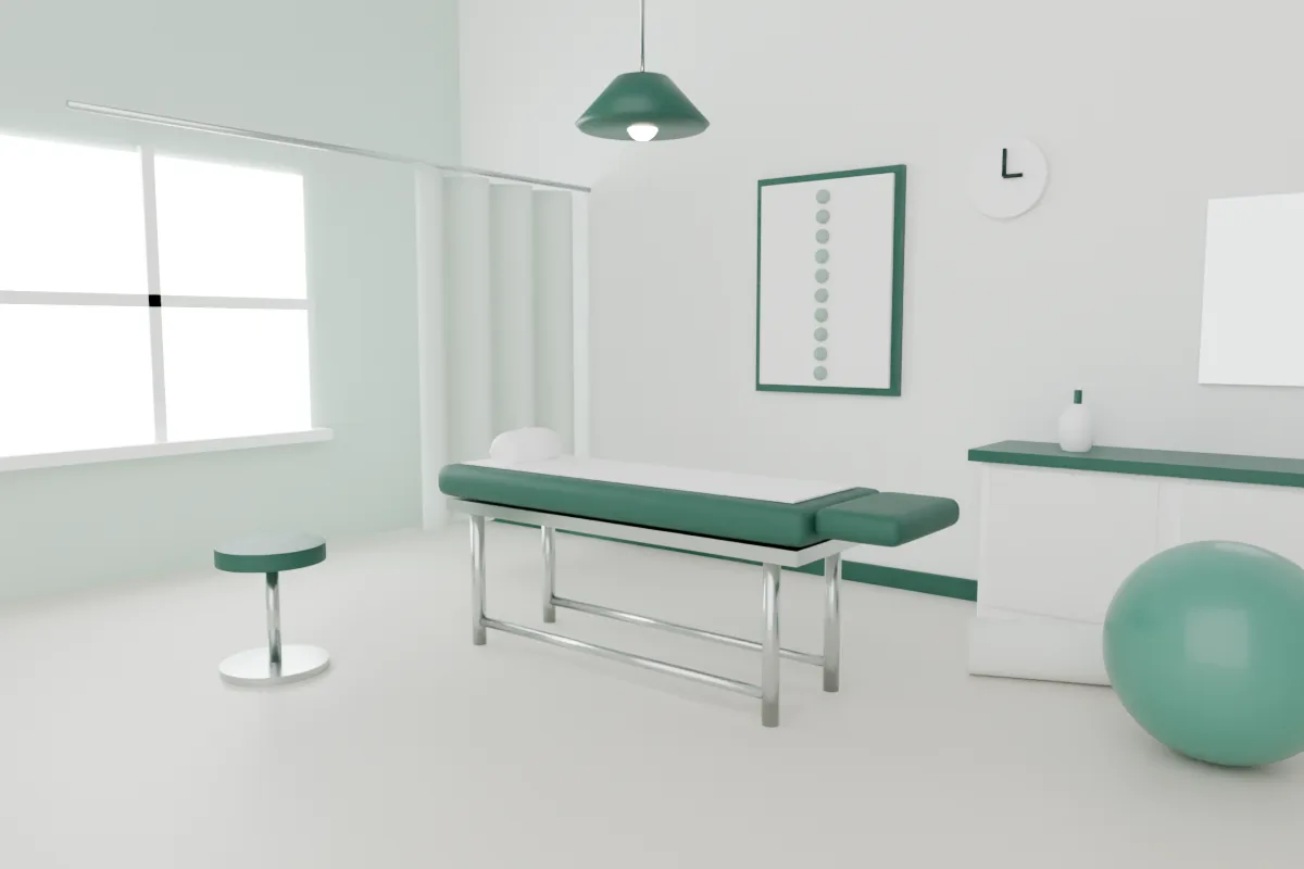
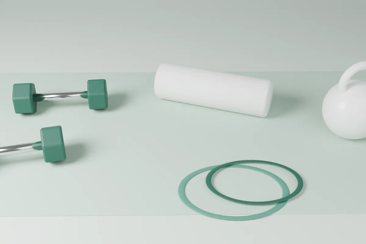
The clinic, shown honestly
Anxious patients want to see where they’re going before they book. So the site shows the actual treatment rooms and equipment — clean, bright and calm — instead of stock photos of smiling models.
The brief
The brief
Northline is a made-up two-room physiotherapy clinic: three physios, early and late appointments, a lot of desk workers with bad backs. The brief I set myself: get someone from “ow” to a booked appointment in under a minute, and make them feel safe doing it.
The problem
The problem
Clinic sites make you read about the clinic before they let you book the clinic.
The usual layout: a stock photo of a smiling receptionist, a welcome paragraph, a services grid, and a “Book now” button that opens a third-party calendar in a new tab. Every step is a chance to give up and phone someone else.
My approach
Three moves
The booking panel is the hero.
First screen: what hurts, which day, which time. It opens on the next free slot, so most people can book in three taps.
Trust, said plainly.
Who’ll treat you, their qualifications, what happens in the first 45 minutes, and what it costs. Up front, in plain words. No stock photos of spines.
Calm by design.
Soft greens, lots of white, one typeface, nothing that blinks. People arrive anxious; the page shouldn’t add to it.
Design decisions
Style tile
One family, generous sizes, soft corners, and a single green that means “go”. No red anywhere — problems are explained in words, in amber, never shouted.
Type1 family
Plenty of patients are over fifty, and some are reading through pain. Big, plain type is a kindness, not a style choice.
Colour4 tokens
Layout12 col · home
Components4 of 12
Book Tue 13 · 09:30 →Desktop + mobile
The booking flow
Three steps on every screen size: what hurts, when, who you are. On desktop the appointment summary stays visible the whole way, so nobody wonders what they’ve agreed to.
On a phone
Big targets. No tiny calendar.
- What hurts — five plain choices and a “not sure”.
- When — the first free slot is already picked.
- Your details — name, phone, nothing else.
What it’s meant to do
The goals
- Let most visitors book in three taps from the homepage. A target, not a measurement.
- Answer “what happens at my first visit?” before anyone has to phone.
- Pass WCAG AA contrast on every screen, with an 18px body minimum.
- Cut no-shows with a reminder the day before and a one-tap reschedule.
No results numbers here, because nobody has booked at Northline. It’s a concept. When a real client’s site goes live, this section gets real results — or an honest note about why not.
Designer’s note
The booking panel opens on the next free slot. Most calls to a clinic ask one thing — when can you see me? — so the homepage answers it before anyone reaches for the phone.
— Fredrick Dishant