Kesar & Crumb
Goal: more weekend pre-orders
A bakery that sells out by 11. The website’s job is to turn that into a reason to pre-order, not a reason to be disappointed.
- Brief
- Self-initiated concept
- Sector
- Neighbourhood bakery, walk-in + pre-order
- Scope
- Home, live menu, 3-step pre-order
- Role
- Design and build, solo
- Year
- 2026
Photography
Art direction
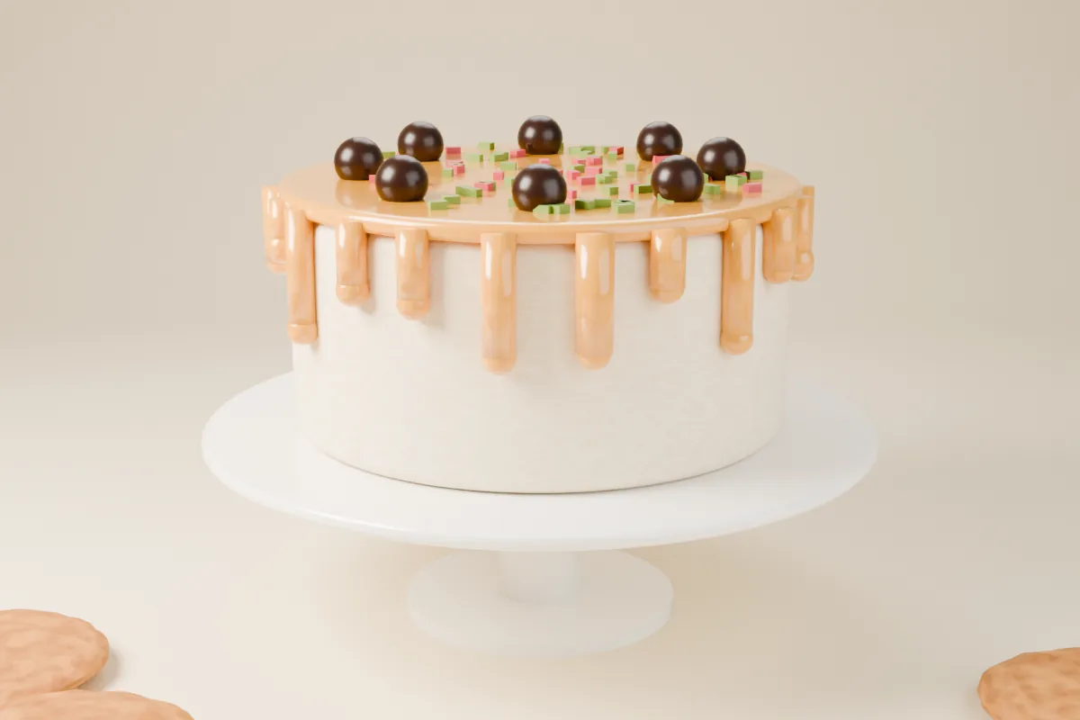
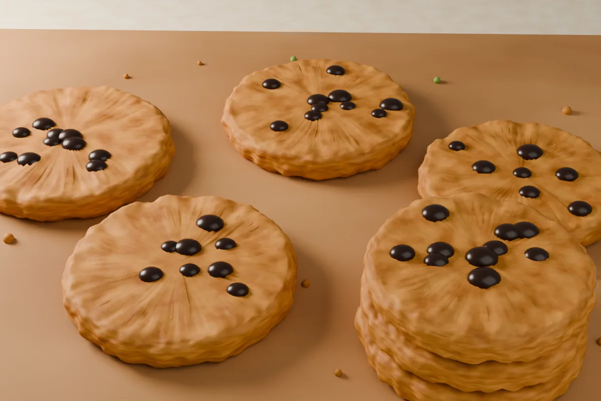
Shot on the counter in morning light: warm, close and a little messy. Crumbs stay in. Every photo answers one question a customer has — what does it look like, and is there any left?

The brief
The brief
Kesar & Crumb is a made-up neighbourhood bakery. One oven, one counter, a menu that changes with the season: saffron in the croissants, jaggery in the cookies. The brief I set myself: a site that sells tomorrow’s bake today.
The problem
The problem
The best things sell out by 11. Most bakery sites still act like the shelf is full all day.
Instagram does the hype, the counter does the selling, and the website sits in between with a PDF menu from last winter. Regulars learn the hard way that the cardamom buns are gone by ten. New customers never find out you can pre-order at all.
My approach
Three moves
Pre-order goes above the menu.
If something can sell out, the first thing on the page is how not to miss it. The menu comes second.
A menu that knows what’s left.
Every item says fresh, nearly gone, or sold out. The bakery updates it from a phone in one tap, between batches.
Pick up, don’t check out.
Three steps: pick a box, pick a slot, pay. No accounts, no delivery maze. You collect it warm from the side counter.
Design decisions
Style tile
Warm paper, brown ink, saffron for anything you can act on. Nothing is perfectly straight: borders wobble, underlines squiggle. It should feel like the chalkboard by the till, not a franchise.
Type2 families
Young Serif has the soft, slightly clumsy warmth of a hand-painted shop sign. Manrope keeps the prices boring and readable, which is what prices should be.
Colour4 tokens
Layout12 col · home
Components4 of 11
Reserve a box →Desktop + mobile
Menu + pre-order
The menu page on desktop, where people browse. The pre-order flow on a phone, where people actually order — usually the night before, usually in bed.
Cookies · from ₹90Cakes to order · 48 hrsDoughnuts · SaturdaysWhat it’s meant to do
The goals
- Sell tomorrow’s bake before the oven’s on, so less goes to waste and fewer regulars leave empty-handed.
- Keep the menu true at 10:45, not just at 7.
- Let the owner update stock from a phone in under a minute, between batches. A target, not a measurement.
- Feel made by people. A neighbourhood place shouldn’t look like a chain.
No results numbers here, because nobody has pre-ordered a Morning Box. It’s a concept. When a real client’s site goes live, this section gets real results — or an honest note about why not.
Designer’s note
Every “Sold out” tag on the menu links straight to tomorrow’s box. The moment a weekend regular is disappointed is the moment they’re asked to pre-order.
— Fredrick Dishant